.....altered book studio.....
The artful world of a mixed media artist and instructor in Northern California.
Tuesday, December 5, 2017
Christmas Cards 2017 Angels
Thursday, September 21, 2017
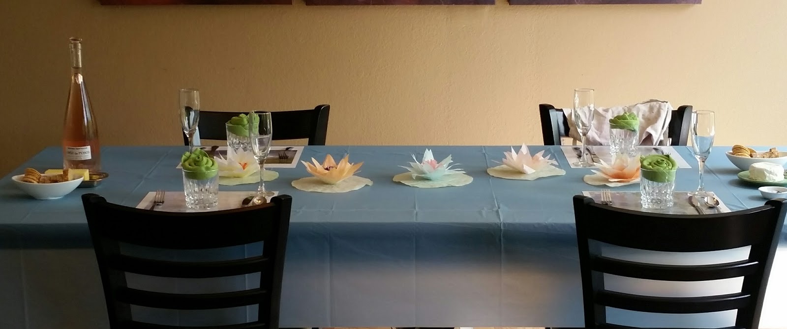
A Little Monet Play Date
Wednesday, September 20, 2017
Play Date Polymer Clay and Birds
Older Posts
Home
Subscribe to:
Posts (Atom)